

1. Complete more than the minimum number (6 regular weekly + 4 writing style = 10 minimum).
2. Include a variety, not just the easy ones.
3. Edit your writing well: check for errors in expression, spelling and punctuation.
4. Include a reference list if you have used other sources (APA style).
5.
Engage with the questions, include your own thoughts but base your answers on the readings and other references, not just your opinions.
Quick Links
Portfolio Exercise 1: Graphics test
Portfolio Exercise
2: Some
rules of good DTP
Portfolio Exercise 3: Compare the layout and design of two different
documents
Writing style exercises
5: Avoiding ambiguity
Punctuation quiz
Writing style exercises 6: Improve your punctuation
Punctuation guides and references
![]()

Q: How do layout and visuals impact on how a reader understands a text?
Week 12 – Using Visuals & Layout in Reports
Given the widespread use of word processing and desktop publishing programs, today's readers expect to see professional layout and graphics in professional documents. The good news is that with some basic training and attention to detail, good layout is easy to achieve and graphics can be quickly and easily produced. The old saying that a picture is worth a thousand words is true! It goes without saying that:
However, graphics should not be placed in a document without a good reason – they should not be there just to make your report look good. They should also be designed and placed in accordance with certain principles, some of which are outlined below.
Relevant Terms

For more detail on this topic, see Chapter 12 of your textbook (pp. 352-355).
Some General Points
Choosing
appropriate and useful graphics can make the difference between whether
or not you appear professional.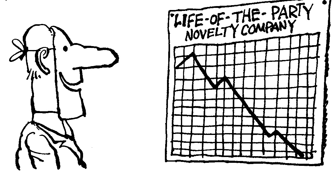 There are some basic points
related to font choice,
colour, and layout which you need to consider. All of these elements
impact in subtle ways on the appearance, readability and credibility
of your document. Here
are some basic questions and things to consider.
There are some basic points
related to font choice,
colour, and layout which you need to consider. All of these elements
impact in subtle ways on the appearance, readability and credibility
of your document. Here
are some basic questions and things to consider.
Eight types of graphics and when to use them
Not all graphics are useful for all purposes. Here is a summary of which graphics to use and when.
Portfolio Exercise 1: Graphics Test
Try this graphics test, created a long time ago by Ray Archee for a course similar to Popcomm. The results suffer from the millenium bug, so it is a bit glitchy.
Hints for a sharp layout
Layout is the non verbal aspect of any piece of written communication. Just like facial expressions or gestures, it adds meaning to the written text. Like a paragraph, it assists a reader navigate your document. This is especially important where your reader is busy and/or your document.

Check out this flash tutorial on how to format your assignment more professionally using Word.
Portfolio Exercise
2: Some
Rules of Good DTP (questions are interspersed here)
Portfolio Exercise 3: Compare the layout and design of two different types of documents
Choose two different types of documents (eg a newspaper or magazine article, sales brochure or advertisement, instruction manual, a letter etc)in terms of the way they have been set out and designed. Think about why this might have been done (ie how does it assist the way people read the document). Answer the following questions with respect to your two documents and include a copy of these in your portfolio.
 |
More
writing & editing exercises
5. Avoid ambiguity
Precise writing is
not wordy or does not use confusing, longwinded expressions. Its purpose
is clear and the language level is appropriate for its readers. It avoids
three flaws: redundancy (see week 9), ambiguity (unclear meaning)
and lack of parallelism (see next week).
Ambiguity is
the possibility of interpreting an expression, phrase or sentence in two
or more different ways. Sometimes it is used intentionally by advertisers
for special effect eg a soft drink ad which says “refreshes like
no other can” ie a play on words ‘can” = “able
to”, ‘can” = “container”. Sometimes ambiguity
is unintentional eg a sign outside a tailor’s shop “Ladies
may have a fit upstairs.”
Causes of ambiguity
can include:
Misplacing the relative pronoun eg 'The office behind the reception area of the sales department, which is large and airy, has enough room for the new photocopier'. It is the office which is large and airy, but the sentence could mean that the reception area or the sales department are large and airy. The relative pronoun which needs to be place next to the word it refers to (called in grammar its antecedent). The sentence should read 'Behind the reception area of the sales department, is an office which is large and airy and has enough room for a photocopier'.
Confusing pronouns eg 'John told the manager he should resign.' Who should resign – John or his manager
Confusing constructions eg 'The doctor is a specialist in women and other diseases.' Are women a disease?
Sometimes, ambiguity can cause humour in headlines. Have a look at some of these.
Writing style exercises 5: Download these exercises on ambiguity, writing simply and positively.
Here are suggested answers to a few of these. You must do the whole set however to include this in your portfolio.
6.
Punctuation IS important !!!!!!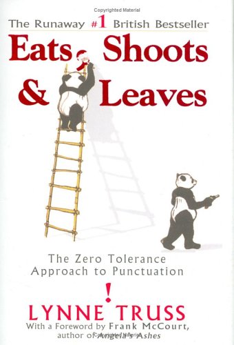
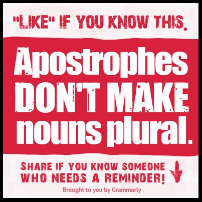
According to Lynne Truss (2004), the author of a very funny and useful book on punctuation called "Eats, shoots and leaves" (here's a review),
Getting your itses mixed up is the greatest solecism in the world of punctuation. No matter that you have a PhD and have read all of Henry James twice. If you still persist in writing, “Good food at it’s best,” you deserve to be struck by lightning, hacked up on the spot and buried in an unmarked grave.
OK, I know it's old fashioned and tedious but in the professional world, punctuation is important to make it easier for a reader to follow your writing. Punctuation does for writing what pauses do for speaking. It provides the traffic signals and road signs for writing.
SO, while it may be acceptable to ignore the general rules of punctuation in social contexts like SMS, MSN, Twitter or email to your friends (note the distinction I have made here: your friends, not email to your clients, boss or work colleagues), it is NOT ACCEPTABLE (emphasis, flashing lights) in professional writing. It merely shows your lack of education, poor attention to detail and lack of consideration for your audience. In short, it reflects poorly on your professionalism.
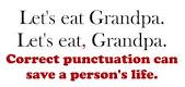
Poor punctuation can change the meaning of a sentence completely:
Letter #1
Dear John,
I want a man who knows what love is all about. You are generous, kind, thoughtful. People who are like you admit to being useless and inferior. You have ruined me for other men. I yearn for you. I have no feelings whatsoever when we're apart. I can be forever happy – will you let me be yours?
Gloria
Letter #2
Dear John,
I want a man who knows what love is. All about you are generous, kind, thoughtful people who are like you. Admit to being useless and inferior. You have ruined me. For other men I yearn. For you, I have no feelings whatsoever. When we're apart I can be forever happy. Will you let me be?
Yours, Gloria
 Try this punctuation
quiz to see if you know your apostrophes from your commas and semi
colons.
Try this punctuation
quiz to see if you know your apostrophes from your commas and semi
colons.
Writing style exercises 6: Download these exercises to test your punctuation skills.
Here are some suggested answers
![]()
For further help, try these references:
 |
 |
Our textbook has been newly revised especially for this unit. Most lectures and many class activities will be based on the book, so we recommend that all students have access to a copy and bring it to class every week. Copies will be made available in the Library Closed Reserve.
In addition, class discussions and presentations will be based on more specific readings on the weekly topic. These can be found under the 'Tutorial Readings' tab at the top of this page.
Professional communication in the news |