 We will have one more face-to-face lecture in Week 9 (after the break) on layout and design. Please note your diaries.
Week 7 - Visual Literacy |
Writing for the Professions Subject No. 101058 |
|
This week's reading is: Kress, G., & Van Leeuwen, T., (2006) Composition and its meanings Ch 6 of Reading Images (2nd ed) London, Routledge pp 175-210 This week's question: Give an overview of the “visual semiotic” approach used by Kress and Van Leeuwen (1996 & 2006). What are the main principles they identify? Find your own examples (as opposed to those in the reading) to either support or debunk their model. |
This week, we are using a lecture on layout previously given by Dr. Dianne Dickenson. Dianne taught an old B. Comm unit titled 'Writing and Document Design' from which both lectures on this topic originated.
We will have one more face-to-face lecture in Week 9 (after the break) on layout and design. Please note your diaries.
Quick Links:
Practical
Exercise 1: Semiotic analysis of advertisements
Practical Exercise 2: Layout and composition of advertisements
Practical Exercise 3: Psychology of colour
Week 7 style principle: Subject/Verb agreement
What is visual literacy?
In this day and age of professional "multi-tasking", professionals in all fields are expected to be able to not only write different styles of documents, but to be able to know something about how layout and design works and to apply these principles in an informed way. For this reason, it is important that professional writing students (and students of communication generally), have a basic understanding of how visuals work.
As we have been discussing, much of the 'meaning' derived from a piece of professional writing by the reader is communicated via the way the text is laid out, the way colours are used, and the ways in which the document is structured visually etc. Remember the points made by Floreak, Redish and Schriver in the week 3 readings? (time to read them if you haven't already done so). Last week we looked at how perceptual theories influence how a reader interprets the design elements of a text.
In their 2007 article The Language of Visuals: Text + Graphics = Visual Rhetoric, Nicole Amare and Alan Manning "advocate teaching a unified system of visual rhetoric that encompasses both text and graphics … within an integrated semiotic system, interpreting in one model the effectiveness of graphics, document design, and formatting, all considered as subtypes of visual rhetoric organised around three primary communication goals: to decorate, to indicate and to inform." They make four key points:
In other words, we need to consider all of the elements together. These interpretations are governed by the way our brains work to interpret visual information. This is the psychology of perception and in particular the theories of 'gestalt'.
What is perception?
Perception is the process of gathering information through our senses, organizing and making sense of it. An appreciation of the processes of perception is an important first step to understanding how we process visual information.
Previous experience and learning, attitudes and interests, needs and feelings, and the current situation all affect perception. All people do not "see" the same thing when looking at a visual image. Perception differs from individual to individual due to a variety of personal, socio-economical, and cultural differences. Age, gender, race, and past experiences are examples of personal perception filters.
Young children, teenagers, and adults "see" things differently. As they grow and develop, children learn to see and comprehend relationships and themes from visuals instead of simply seeing individual objects and shapes.
The way that we "see" or understand events, words, people and so on can be affected by different filters. These can be socio-economic such as occupation, level of education, environmental factors, and family upbringing (remember the list from Berlo's model). Or they can be cultural. Cultural filters include language, e.g. Eskimos have many unique words describing different kinds of snow. Not just adjectives that go in front of a standard word for snow, but totally different words. Customs, belief systems, and historical perspectives are other filters which change perception. Think about how supporters of different football teams interpret the decisions of a referee or an umpire.
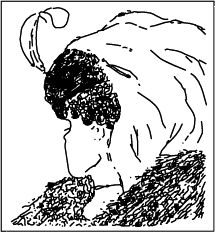
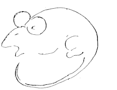
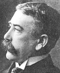
Every characteristic of an individual influences what that individual chooses to see, hear, taste, touch, and smell. How information is interpreted to create meaning for an individual is also influenced by his/her unique make-up and background. Things like: expectations (you are scared so therefore you interpret a shadow as a burglar); previous experiences (in the rat man illusion, showing people previous drawings of animals impacted on whether they saw a man or a rat); and learning (printers or spray painters can see more minute variations in colours than the average person), will all impact on our perceptions. Creating effective visual images depends on the appropriate use of design elements and design principles. Here are a few famous examples.
1. Can you see an old lady or a young lady? Keep looking.
2. Do you see a man or a rat? In Freud's experiment, it depended on whether the subjects had been shown drawings of animals or humans beforehand.
3. A pile of rocks or a man's face? Knowing it's
there makes it easier to see.
Perception is part of the process of understanding visual images. Background theories of perception are often based on principles of 'gestalt psychology' which refers to a theory that humans perceive things as holistically ie we see the whole rather than the sum of the individual parts. Check out these links for more information or do a Google search using the keyword 'gestalt'.
http://www.princeton.edu/~freshman/gestalt/index.html
http://homepages.ius.edu/rallman/gestalt.html
http://webspace.ship.edu/cgboer/gestalt.html
from http://graphicdesign.spokanefalls.edu/tutorials/process/gestaltprinciples/gestaltprinc.htm#figureground
Closure occurs when an object is incomplete or a space is not completely enclosed. If enough of the shape is indicated, people percieve the whole by mentally filling in the missing infomation. Proximity occurs when elements are placed close together. They tend to be perceived as a group.The fifteen figures above form a unified whole (the shape of a tree) because of their proximity. Figure/Ground is when the eye differentiates an object form its surrounding area. a form, silhouette, or shape is naturrally perceived as figure (object), while the surrounding area is perceived as ground (background). In this image, the figure and ground relationships change as the eye perceives the the form of a shade or the silhouette of a face.
Continuation occurs when the eye is compelled to move through one object and continue to another object. Continuation occurs in the example above, because the viewer's eye will naturally follow a line or curve. The smooth flowing crossbar of the "H" leads the eye directly to the maple leaf. Similarity occurs when objects look similar to one another. People often perceive them as a group or pattern.
Semiotic theories
An important perspective about how we interpret visuals is the study of signs or semiotics. Important early theorists in the field of semiotics are Ferdinand de Saussure and Charles S. Peirce, both of whom were influenced by Sigmund Freud's Interpretation of Dreams. Later important theorists include Roland Barthes and Umberto Eco. Kress and Van Leeuwen use what they refer to as 'visual
While semiotics is a large and complex topic, Daniel Chandler in his book Semiotics: the basics (2nd ed; Oxford; Routledge, c2007)., gives a good overview of the history and principles. He says in the opening chapter that:
We seem as a species to be driven by a desire to make meanings: above all, we are surely Homo significans - meaning-makers. Distinctively, we make meanings through our creation and interpretation of 'signs'. Indeed, according to Peirce, 'we think only in signs' (Peirce 1931-58, 2.302). Signs take the form of words, images, sounds, odours, flavours, acts or objects, but such things have no intrinsic meaning and become signs only when we invest them with meaning. 'Nothing is a sign unless it is interpreted as a sign', declares Peirce (Peirce 1931-58, 2.172). Anything can be a sign as long as someone interprets it as 'signifying' something - referring to or standing for something other than itself. We interpret things as signs largely unconsciously by relating them to familiar systems of conventions. It is this meaningful use of signs which is at the heart of the concerns of semiotics.
Saussure said the 'sign' was composed of two parts:
| A ‘signifier’ = the form which the sign takes + the ‘signified’ = the concept it represents. The relationship between the two is referred to as 'signification' | 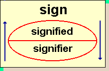 |
| Saussure believed the relationship between the two was arbitrary and that we learn the meanings via our language and culture. | 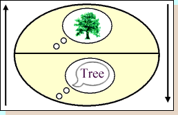 |
For more information here's the direct link to the online version of Chandler's book: http://www.aber.ac.uk/media/Documents/S4B/sem02.html
The 'Grammar' of
Visual Design 
In general we need to keep in mind that reading is a visual act and written language uses visual codes to communicate: fonts, space, alignment, contrast, size, placement and so on. As a culture, we see visual representations as highly significant, yet we don't always understand how we make meanings from visuals.
In their book Reading Images: the Grammar of Visual Design (2nd ed), Gunther Kress and Theo van Leeuwen (2006) examine the nature and practice of visual rhetoric. The book draws on an enormous range of examples from children's drawings to textbook illustrations, photojournalism to fine art, as well as three-dimensional forms such as sculpture and toys, the authors examine the ways in which images communicate meaning. The second edition also looks at moving images and on color, discusses how images and their uses have changed through time, websites and web-based images, and ideas on the future of visual communication. Reading Images focuses on the structures or "grammar" of visual design: color, perspective, framing and composition.
Practical Exercise 1: Semiotic analysis of advertisements
In class you will be given a selection of advertisements. There are links to some of these in the table below.
Choose one and in groups of two or three, identify the visual elements of the advertisement and discuss your group's interpretation of how they work together (or don't) to create the persuasive meaning of the advertisement. Write up a simple semiotic analysis of the visual elements. Keep a copy of your answer to include in your portfolio. Remember to also include copies of the advertisement.
Things to look at might include:
- significance of colours and images used;
- size and placement of different visual elements (top, bottom, left, right); choice of visual elements – how do they contribute to the advertising message, why were they chosen?;
- the way the various elements work together rhetorically i.e. how do they contribute to the persuasive intent of the message;
- the ways in which the text works with the visual elements to support the persuasive message – consider linguistic features of the text (words chosen, organisation of information etc
Practical Exercise 2: Kress and van Leeuwen identify three principles of layout/composition:
Find at least two of your own examples of advertisements from either newspapers, magazines or the Internet, and explain how the way the advertisements are composed visually either support or debunk the principles outlined in the reading and lecture. Some examples may be used to exemplify more than one principle so your answer should show an understanding of the principle/principles in question. Include copies of the ads with your exercise along with a reference, making sure that you briefly explain how these principles are used and the impact this journal articlewhich makes use of Kress and Van Leeuwen's system to analyse another form of composition.
Research Exercise
3: Do some reading on colour psychology
Like all things experienced through the senses, colours have the ability to communcate in subtle ways. For example, did you know that organisations such as Weight Watchers recommend that dieters eat their meals from a blue plate because the colour blue is calming and is an appetite suppressant. The reason for this is mostly likely has its roots in our evolutionary history as there are very few foods that are naturally blue. To see how this applies to layout and design, complete the following steps:
Here are some links for you to investigate further:
Creating Professional Visuals - a how-to guide to using visuals in your work
How to do Layout - tips and tricks
How to Use Type - more tips and tricks
What is Visual Literacy - looks at typography, colour and visual data
A common error in professional and academic writing is the use of the wrong form of the verb for its subject. In other words, the verb chosen does not agree with the subject in terms of ‘number’ (ie singular or plural), or person (1st person, 2nd person or 3rd person). Subject-verb agreement errors not only affect the clarity of the writing, but also the credibility of the message and the writer.
Here are some examples of errors in subject-verb agreement – the incorrect sentence is in red and the correct one is in blue. The verbs in question are underlined. The explanation is # underneath.
1a. John live in France.
1b. John lives in France.
# The subject 'John' requires the third person singular form of the verb to 'live' (lives).
2a. He were in Italy before that.
2b. He was in Italy before that.
# The subject 'he' requires the third person simple past form of the verb 'be' (was).3a. Both the United States and China supports the new proposal.
3b. Both the United States and China support the new proposal.
# The subject 'both the United States and China' requires the third person plural form of the verb 'to support' (support).
4a. The argument outlined by the politicians are sound and well supported.
4b. The argument outlined by the politicians is sound and well supported# The subject 'argument' requires the third person singular form of the verb 'be' (is)
For further explanation, here's a flash tutorial on subject/verb agreement. You might also want to check out this page as well as this link.