1. Content: From a broad point of view, many reports lacked substance. The aim was to research a general problem from one of the two scenarios (such as web site design) and then apply it to a specific example in a company that you know. Many students wrote as if they were experts and, despite having some good references, did not make the connection in their analysis or comments, to support or substantiate their findings. For example, if you were looking at the aspect of usability, cultural appropriateness, colour, navigation etc, you needed to firstly paraphrase and then cite what the research says about these aspects. After that, make your observations to illustrate how the website that you are talking about fits/doesn't fit these principles. Be specific: don't just say "the website is not usable" or "the navigation was poor", you need to say why. Citing your sources (which should be listed in full in your bibliography) when you discuss the pros and cons of your observations, shows that you are not just writing off the top of your head, but are making informed analysis based on research. 
2. Parts of the report: This was mostly done well, although here are a few things that could be improved.
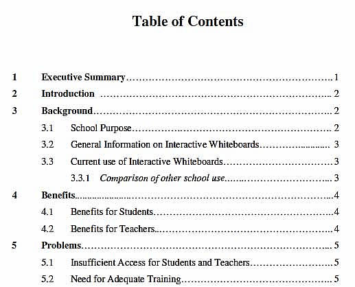
- Table of Contents: This should show the structure of the report via the use of a numbering system (decimal numbering recommended), page numbers and headings and sub headings. Page numbers should be listed on the far right hand side and numbers should be aligned. Indenting sub sections (as shown in example), makes it easier for readers to visually see the related structure. See the example on the right.
- Executive Summary: In a business report, this should be set on its own page (unlike an Abstract in a Research Report). It should enable a reader to understand specifically the problem being addressed, how it was addressed (method), the main findings and conclusions/recommendations. Some readers will only read the summary.
- Introduction: Many students needed to develop this important part of their reports. This is where you need to introduce the problem (maybe with background description or history of the problem), tell the reader why this is a problem (how do you know) and tell them which aspects of the problem the report with cover (scope). An introduction may have sub sections or may be a series of related paragraphs.
- Method: The method is descriptive and should tell the reader HOW you have gone about your analysis and perhaps which criteria you have used and why. For example, if you are writing about a web page, you could list and describe here which particular criteria you have used to analyse the effectivness, or the aesthetics or usability of the particular website you are looking at.
- Headings and Sub headings: These should be written descriptively not vaguely or broadly. For example, the heading "Problem" is too vague. What problem? Headings and subheadings should also be set out consistently and each level of heading should use the same font type, size and weight (ie bold, italic).
- Graphics and Illustrations: Many students used graphics but either put them in an Appendix (which is ok if you have quite a few or if they are supplementary) or did not refer to them or discuss their relevance in the text. If you only have a few graphics, they should be placed in the body of the report.
Remember that all graphics should be labelled (eg Table 1, Figure 1), have a descriptive title (Homepage of XYZ P/L) and be referred to in the text eg "As shown in Fig 1, the homepage of XYZ P/L is cluttered with too many flash animations and an unclear navigation labels." If you use a screen shot or group of screen shots, it may be useful to label them. Import them into Word and then use text boxes and lines to comment on relevant aspects (an example is shown right). Ask your tutor in class if you don't know how to do this.
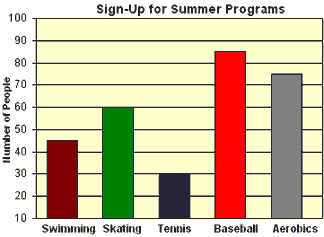
Graphs and charts also should be relevant, axes should be clearly labelled and their relevance discussed in the text. If you have taken them from another source, place that beneath the graphic using APA style. A couple of examples are shown below (not bad except they need labels eg Fig 1 etc). - Tables: In professional reports, tables are used extensively to show comparisons. The table/s gives the report a professional tone, and acts as a way of judging a credible evaluation of anything. Computer magazine comparison reports of software/hardware are a good place to see these tables in action. There are five (5) specimen real life reports placed online in week 9 on the report writing week. All use tables in a variety of formats. Check these out and if you are unsure how to create tables in Word, bring your assignment to class next week for some help.

- Bibliography and/or Reference List:Your report MUST have at least six (6) references (but it is a good idea to have expanded your original list from yourAnnotated Bibliography). Some people still seem unsure of how to set this out correctly using APA style. I can only say again, refer to this handout from the Library and which is also linked on the vUWS homepage. Different reference types (eg books, journal articles, web pages etc) have slightly different layout conventions.
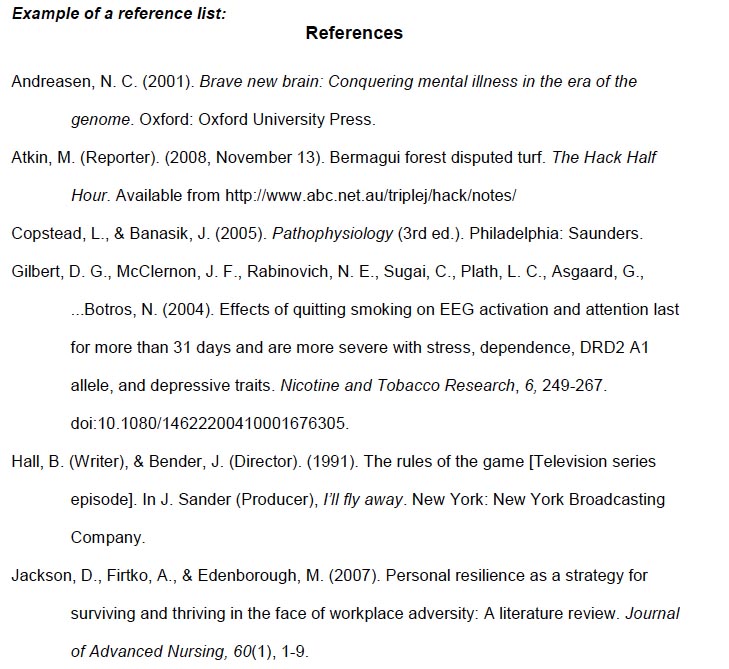
Your reference list should be set out on its own page at the end of your report, should be listed alphabetically by author's surname and should include all the relevant information related to that reference. Remember that the way that you have set out the reference should enable a reader to find that reference for themselves. Italics are generally used for the name of the primary source (eg book or journal or newspaper title), There is NO need for dots or dashes before each reference or for headings like "Books", "Journal Articles" etc. See the example on the right from the APA style guide. Note that ideally, each reference should also have a hanging indent.
- In text citation: When either quote directly from your sources, or paraphrase an argument or point that you've read, you must cite the source. APA style uses the author/date format and some students still have difficulty with the conventions.
- Remember that if you refer to the author in your sentence, you place only the year in parentheses eg "Nielsen (1999) argues that readers of print documents and readers of online documents approach the task of reading differently." You don't need the author's initials or the name of the reference itself.
- If you paraphrase an argument or information that you have taken from an external source, you place both the author's surname and date of publication within the parentheses eg "It can be argued (eg Nielsen, 2007), that modern web design should be based on an understanding of how readers engage with online material, not merely the use of high tech, flashy gimmicks."
- If you quote directly from a source, you also need to include a page reference if possible (may not be possible from a website). For example, "Smith (2011, 26) says that " ............... "."
- Longer quotes (more than two lines), should be set out as block quotes – in a separate paragraph, 1 pt smaller font than main text, space above and below and indented left and right. See the example below. This reference of course should be listed in full in your bibliography at the end of your report.

- Formatting your report to make it easy to read: Remember that reading is visual and so your layout is part of the way the report communcates and also is part of the impression the reader has of you. In some ways it is the non verbal element of writing. Remember the basic layout suggestions from Week 12.
- Body text should be between 10 and 12 point. Headings can be larger
- Use the same typeface, type size and leading (line spacing) for all your body copy
- Use enough leading (space between the lines) to make the text easy to read – if using Word, 1.5 line spacing is useful
- Make paragraph beginnings clear – paragraph space is preferable to indentation
- Ragged right margins make text look more visually interesting. Avoid justification of text
- Leave more space above headlines and subheads than below them. Use subheads liberally to help readers find what they are looking for
- White space used skilfully can be used to show readers where to start and where to stop. It can isolate important messages
- If you choose a design device use it throughout the document to establish a recognisable pattern. For example:
- Signals used (arrows or numbers)
- Words or terms used for captions
- Format of questions or headings
- Use of screened backgrounds
Typeface and type size used for text, headings and captions
- Check out my flash tutorial again on how to format your documents.
- Edit your work: Spelling, punctuation and expression errors reflect on your professionalism and the quality of your argument. Use the spell checker and get someone else to read your work through before you submit. We have been working on style over the last few weeks, so try to apply these principles to what you write.


